Over the past few weeks I ended up on the official White House newsletter list. Despite your feelings about this presidency – they can’t write a decent email to save their lives and it’s driving me crazy!
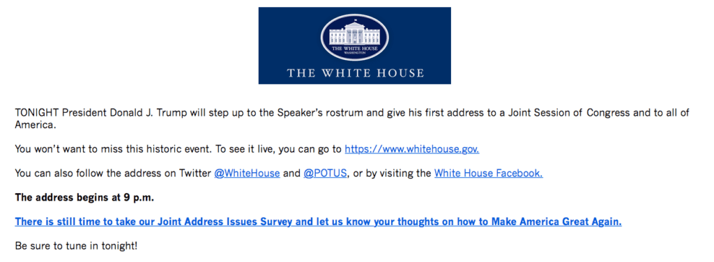
First off, I would love to share a link so you can read the most recent email, but they don’t give you an option to view the email in your browser if it’s not displaying correctly. So, that’s a bummer for them. And means a screen shot for you…
A short and sweet email is always a good thing, and that’s the purpose of this recent email, reminding people to watch the Presidents first address to the Joint Sessions of Congress. Here’s simple things they could have done to make this email work better for them:
- Link the Logo to their website – I was pretty surprised at this simple error – any time you use an image in a newsletter it should link to your website or the blog post you’re referencing or any other appropriate link.
- Don’t start with ALL CAPS – start by greeting. A friendly “Hi Elizabeth – ” wouldn’t hurt. But they just jump right in with TONIGHT. (No need to yell, just ask nicely, we learned this in Kindergarten)
- Clarify the Time -I live in Portland so the address wasn’t at 9 PM it was at 6 PM AKA 9 PM Eastern. A really easy thing to clarify. (And for an administration who claims to be inclusive of middle America this wasn’t good)
- That giant link – You should always properly link to what you’re talking about (see #1) but highlighting the entire sentence isn’t necessary. And if I were designing this email I’d probably have created a bright red (or blue) button for people to click on to take the survey.
- Say Thank you – or not, but that’s how the email ends, I didn’t cut off the closing statement, that’s where it ends. Be Sure to Tune In Tonight!
- Better Social Media Sharing – Mail chimp (and most newsletter programs) make it so easy to include all your social media links and accounts – writing it out wasn’t necessary and looks clunky. I’m sure this isn’t Mail Chimp but whatever program they’re using should be able to easily include social media links.
- Unnecessary White Space – this makes me angry because it’s lazy. Clean that up.
- Missed Footer Opportunity – I’ve got a privacy policy, and contact us and an unsubscribe option. Remember how rad Hillary Clinton’s footer was? Yeah, the White House could learn a few things.


Leave a Reply