The thing about running a political campaign is that you send a lot of emails to your supporters. It’s ridiculously overwhelming and very easy for people to unsubscribe so you just go away and stop harassing them for more money. If you follow me on Twitter you’re probably aware #ImWithHer – I promise you this isn’t a political post. The other day after the 7th email from HRC’s campaign I decided that I don’t need to hear from her more times a day than I have to let Norm outside. So I scrolled to the bottom of the email to see if I could reduce the number of emails I receive and what I found instead was BRILLIANT.
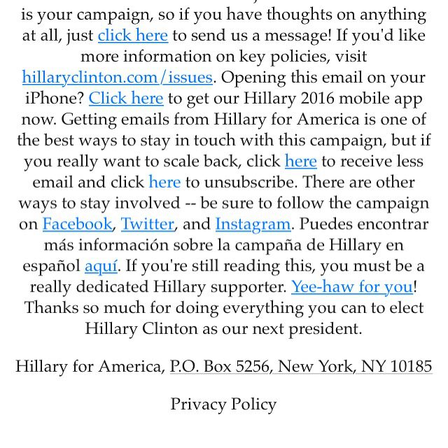
Here’s 8 great ideas I discovered from Hillary’s email footer.

- Feedback! First things first – this is MY campaign – and they asked for feedback – what a great idea! Asking your contacts for feedback is always awesome. If you send your newsletter on a very regular basis this is a good idea…
- Key Policies – I like that they also included a link to more information on her key policies. For a business owner you might say something like “want to learn more about the services we offer? Visit http://yellowdogconsulting.com/services/“
- There’s an App! – Small business owners don’t often have apps – but a lot of folks in direct sales might have them, and this is a creative way to remind folks to download the app without overwhelming the newsletter each month, clever.
- Update Your Preferences – you can choose to receive less email (which I am terrified of folks who didn’t do that, I still get 5 a day!) or unsubscribe. I like that it’s a bit more sandwiched in and you have to read to find it. Typically I find this annoying but they did it so well…If you have multiple lists or are sending out emails for a variety of offerings I highly encourage creating lists that your subscribers can pick and choose from.
- Social Media links – typically I suggest you add in your social media icons earlier in the email, however throwing it right into the footer there for folks who unsubscribe but still want to be aware? This is clever…
- There’s a Spanish option! – okay this one honestly makes little sense to me. If I preferred my newsletter in another language this would be more helpful at the very top preview of an email instead of squished into the middle of a footer.
- A Super Secret Picture – This is just clever. I like to add easter eggs in blog posts and newsletters occasionally but I hadn’t thought about my newsletter footer before!
- Thank You! – A very smart move here, you probably read the email that was sent and you’ve read all the way to the bottom of the footer. Holy crap you do deserve a fun picture and a thank you.
If people scroll to the bottom of your email just to unsubscribe wouldn’t it be cool if instead of leaving you forever they actually became more engaged?

 Lately as I’ve been talking to clients, I’ve seen an increased request to get found online. But where do you start? Yes you can hire SEO firms to work with you on this, and depending on what you do that might be a great idea. But if you’re a small business owner like me, it may not be in the budget. So where do you start? Here’s what I suggest to my clients: